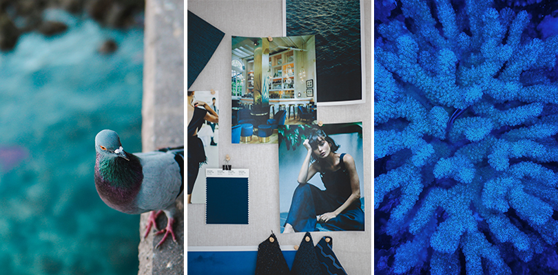
Pantone’s Classic Blue Through Textiles
Blog • August 30, 2020
Last December, Pantone named Classic Blue its 20th annual Color of the Year.
Pantone’s Color of the Year influences products across fashion, home furnishings and industrial design. Remember millennial pink? One of the most popular shades in recent memory, this color took over merchandise, décor and Instagram feeds. Not many people realize that millennial pink can be traced back to Pantone’s 2016 Color of the Year, Rose Quartz.
Choosing the color of the year is no easy feat. Pantone’s experts analyze global trends from entertainment and art to travel destinations and socio-economic conditions.
As we reflect on the first half of 2020, Pantone’s pick of Classic Blue last winter seems prescient. The first six months of this year were turbulent and challenging for many. Classic Blue restores a sense of calm and connection. It’s reliable and dependable. It acts as an anchor, grounding us and re-centering our thoughts.
Blue has more complex meanings than any other color, taking on several different meanings based on the hue:
Dark Blue – Trust, dignity, intelligence, authority
Bright Blue – Cleanliness, strength, dependability, coolness
Light Blue – Peace, serenity, ethereal, spiritual
At Pallas, we strive to create sophisticated textiles that stand the test of time. Naturally, blues are woven into our portfolio in several ways. Depending on the design direction, Pallas offers blues in a range of hues, solids, textures, and complex mid- and large-scale patterns, in wovens and non-wovens.

LAYING THE FOUNDATION
If you’re using blue as a foundational element, there are several classic blue-inspired solids and near solids that can act as the foundation for more colorful, bold, playful accents. Popcorn/Blue Cheese is a solid with a basketweave construction, which provides subtle depth. Nap/Cobalt also provides a grounded solid.
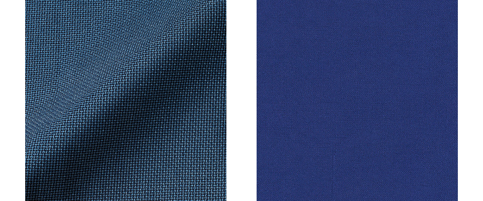
Options like Cybele/Indigo or Posh/Boutique Blue offer a classic blue feel with light blue accent yarns, giving the pattern more interest while keeping it neutral in nature.
For healthcare spaces or other areas where a non-woven may be a better choice due to a higher level of performance requirements, Pallas offers selections like Arjuna/Kolakolli with its leather-like appearance, the slight sheen of Burnish/Naval or Tech/Lake, a non-woven pattern that gives it the illusion of a woven.

MAKING A STATEMENT
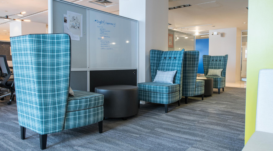
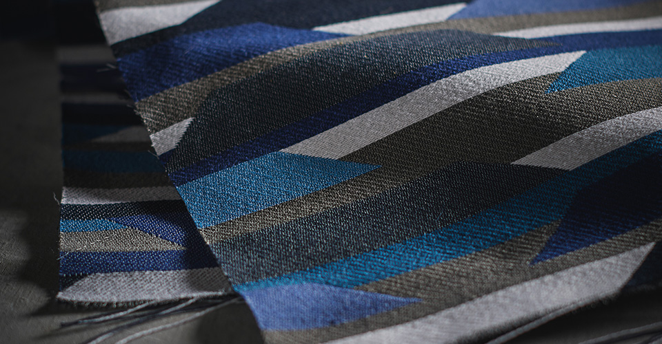
If the intent is to make a statement or add eye-catching accents, Pallas offers several mid- and large-scale patterns in a range of blues.
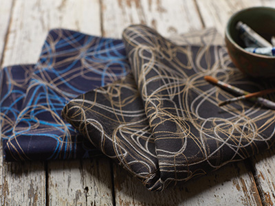
Awe/Midnight Navy – random overlapping curved lines
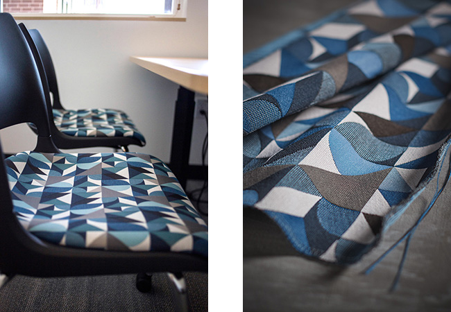
Nomad – brazen, distinct geometry
Sherlock – classic houndstooth creates an oversized plaid effect
Trek – vibrant color schemes reinforcing a dramatic sense of movement
ALL THE FEELS
Texture also plays an important part in defining space. Pallas offers blues in several different constructions to create different aesthetics.
Coco – boucle yarns for a subtle soft nubby hand
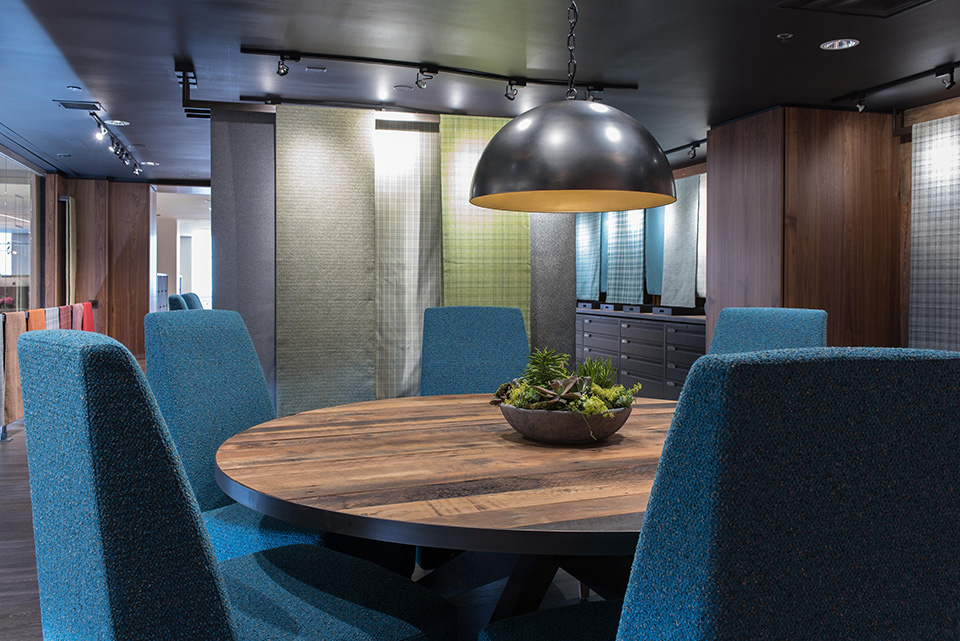
Essentials Collection – plush fabrics and supple faux leathers
CONTRASTING AND COMPLEMENTING
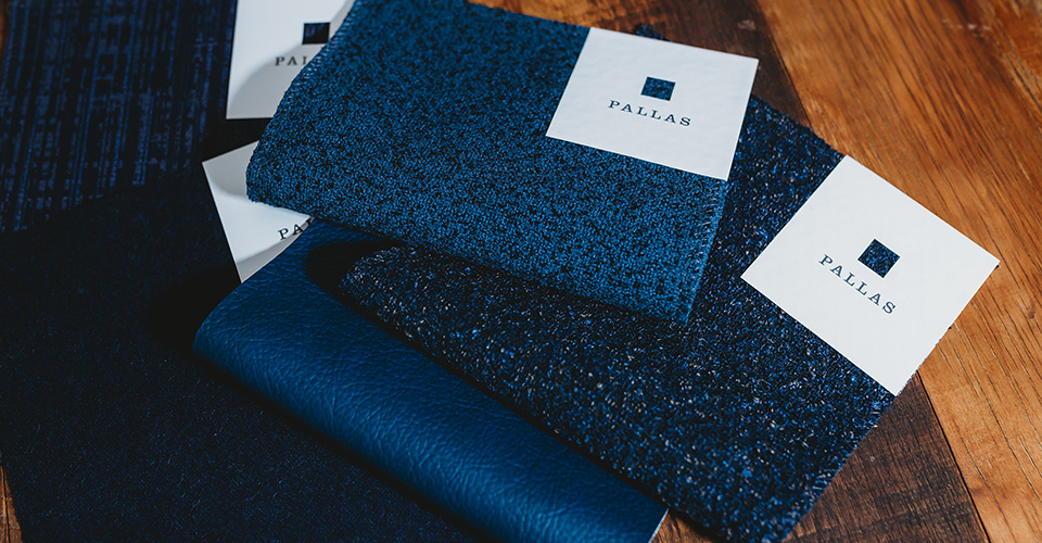
Blues provide a fantastic opportunity to play with contrasting and complementing palettes.
Contrasting and complementary recommendations
1. Specify a large scale pattern with a neutral foundation like Ethos/Ocean and Nap/Stone

2. Try tone-on- tone combinations like Aphrodite/Thames and Bedford/Milo for a sophisticated feel
3. Pair different textures like Burnish/Nile and Fuse/Azure to create visual interest

With its versatility and dependability, Classic Blue is a foundational design element for textiles of various patterns and constructions.
Has Pantone’s Classic Blue made its way into any of your current projects? To explore blue offerings from Pallas Textiles, browse by color group and undertone on our website.
