
Our Color Selections for Healthcare Spaces
Blog • August 30, 2020

Color is a fundamental element of environmental design. It’s an effective form of non-verbal communication with the power to convey messages, suggest values and express ideas.
For example, a yellow rose signifies friendship. In China, red represents good luck. In the United States, green can represent nature or envy.
Color can also foster an emotional reaction. Orange energizes, while blue calms. When designers understand the emotions that colors draw out, they can better employ those colors to enhance environments.
Color is particularly important in healthcare spaces. Even a routine visit to the doctor can trigger anxiety or stress for a patient and their family. Those with more serious or long-term conditions may spend more time in a healthcare facility than any other space aside from their own home.
Here are some of our color recommendations for healthcare environments.
Yellow Engages Younger Patients
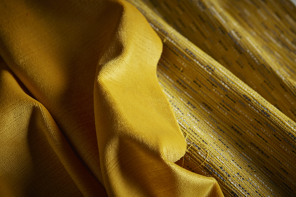
In pediatric environments, designers may consider vibrant and playful primary colors like yellow, cobalt blue and even an occasional accent red. Children respond well to a variety of colors; that variety keeps them stimulated.
Yellow in particular is a great fit for pediatric spaces. It’s optimistic, inviting and uplifting. In his book In My Room, author Tony Torres Torrice, Antonio F., ASID and Ro Logrippo. In My Room. New York: Fawcett Columbine, 1989. notes that children with asthma and breathing problems react most favorably to yellow.
Spa-like Blue and Green for Intensive Care

Cooler colors are better-suited to intensive- or critical-care floors and cancer wards. Patients and families in these environments are often under severe stress. Color can help assuage their anxiety. Blues and greens paired with neutrals with cool undertones could work well in these spaces.
Blues have long represented calmness. The color’s association with the sky makes it heavenly and infinite. Blue also lowers blood pressure and slows the heartbeat, helping people breathe deeply as it relaxes muscles and the mind.
Green is restful and healing. When the eye perceives green, it doesn’t need to make an adjustment. As the color of nature, it signifies balance, harmony and renewal.
Designers may opt for refreshing blue-greens, like turquoise and teal. Spas often employ these hues because they soothe tension and stress. They may remind patients of relaxing environments, like an ocean view.
Soft Pink is Soothing for New Parents
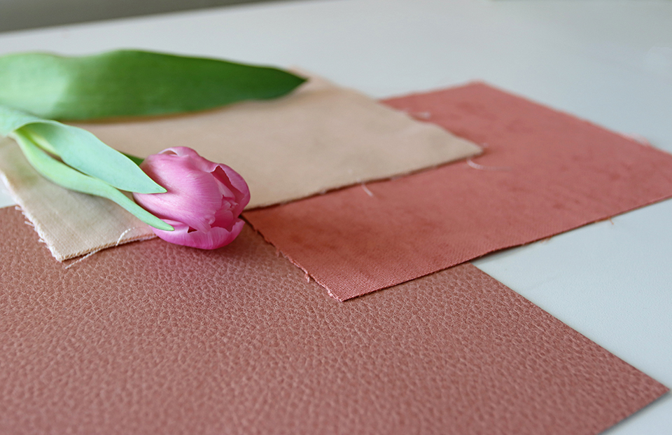
Pink represents care, affection and tenderness. While hot pink or fuschia may be too stimulating for a healthcare environment, a softer pink palette can put patients at ease. In particular, blushes and corals are well suited to maternity wards, where the hues may provide comfort to anxious new parents.
Red and Orange as Accent Colors

Designers for healthcare spaces don’t have to shun stimulating colors like reds and oranges. These color families radiate warmth and grab attention. But they also release adrenaline, which elevates blood pressure and quickens the heartbeat. These energizing colors are better-suited as secondary or accent colors, rather than the main focus within a healthcare space.
Colors on the Mind
For more on the attributes and meanings of different color families, check out our white paper, “Color and Healing: The Power of Color in the Healthcare Environment.” Its insights are valuable for those looking to design healthy environments, no matter the industry.
Are you thinking through the color palette for one of your current projects? On the Pallas Textiles website, you can browse textiles by color group and by warm or cool undertone.