Art That Endures: The De Stijl Movement
Blog • April 25, 2022

Over time, we encounter rare yet fundamental movements in art and design that possess a gravity which sustains for decades or perhaps even centuries. From modernism to post-modernism movements, we see lasting effects in visual graphics and applied mediums to this very day.
One such movement is De Stijl.
Literally translated as “style” in Dutch, the De Stijl movement emerged in the Netherlands in the aftermath of World War I. Founded by Piet Mondrian and Theo van Doesberg, De Stijl is grounded in order, geometry and simplicity.
And it has had an incredible impact on contemporary art, architecture and design, as well as pop culture and technology.
Geometric Lines
De Stijl is most recognized for its strict adherence to geometric lines—horizontals, verticals, squares and rectangles—that still persist in contemporary styles.
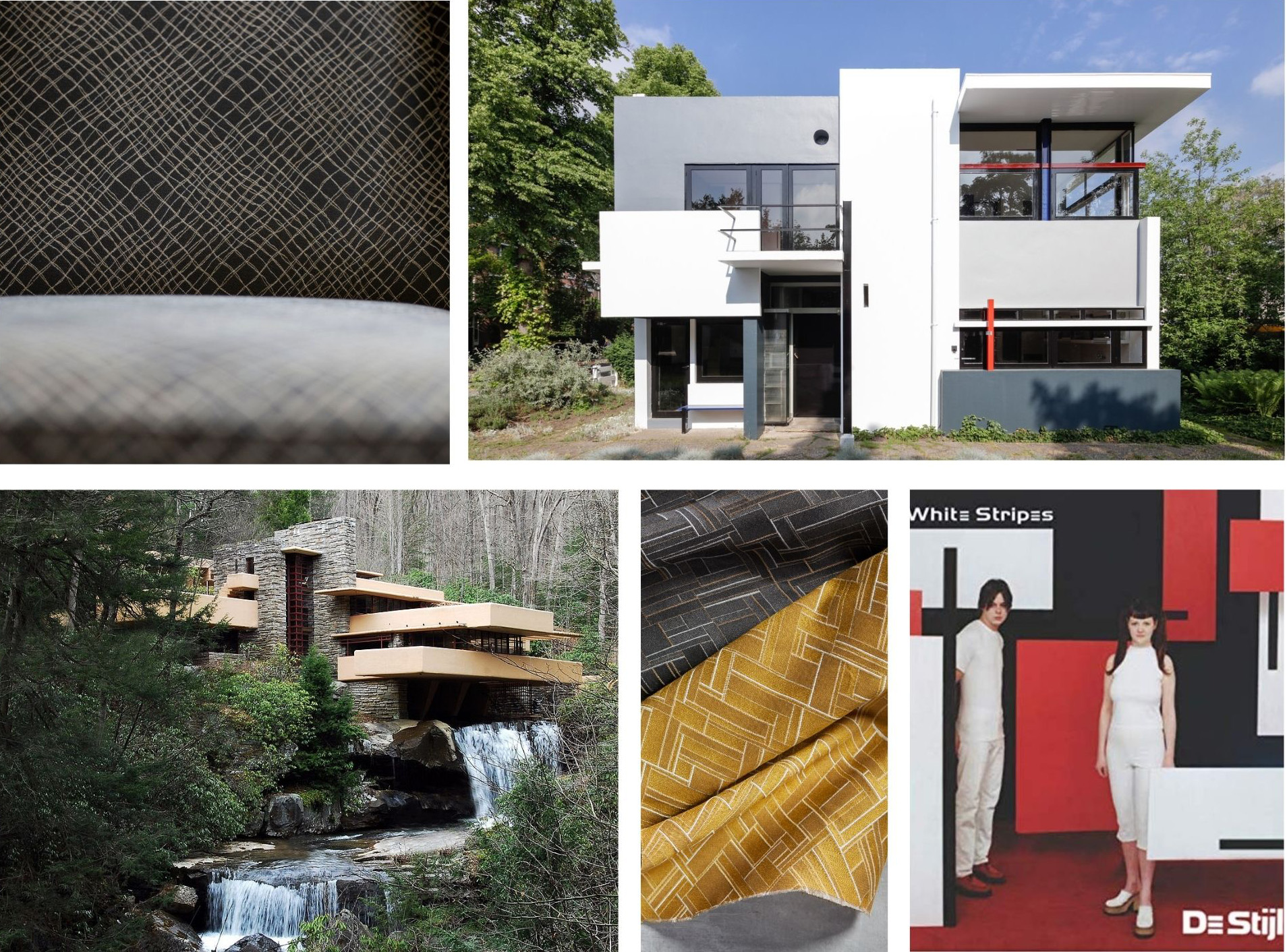
We see it in the work of German-American architect Ludwig Mies van der Rohe, most notably in his Farnsworth House with its starkly linear frames and straight-edged squares and rectangles as focal points.
Frank Lloyd Wright routinely employed clean lines and geometric forms in his iconic modern structures, including the renowned Falling Water.
Dutch architect Gerrit Rietveld’s work, specifically the UNESCO World Heritage Site Rietveld Schröder House, also features the staples of De Stijl era architecture.
De Stijl’s clean lines and geometry permeate pop culture, too. The rock band The White Stripes titled their 2000 album De Stijl. The cover features the two-person band amid angular, life-size geometric forms.

Photos courtesy of wikipedia.com, rietveldschroderhuis.nl, and amazon.com
Similarly inspired, we designed our Elemental upholstery collection with the styles of De Stijl in mind.
Asymmetric is a nod to the architectural elements of this movement with gently bending lines that maintain geometric forms while conveying motion. Construct plays on van Doesburg's use of lines, with varied weights to create dimension.
Primary Colors
Primary colors are at the heart of De Stijl. An extension of the movement's pursuit of order and simple forms, primary colors add clarity and continuity across a host of artistic mediums.
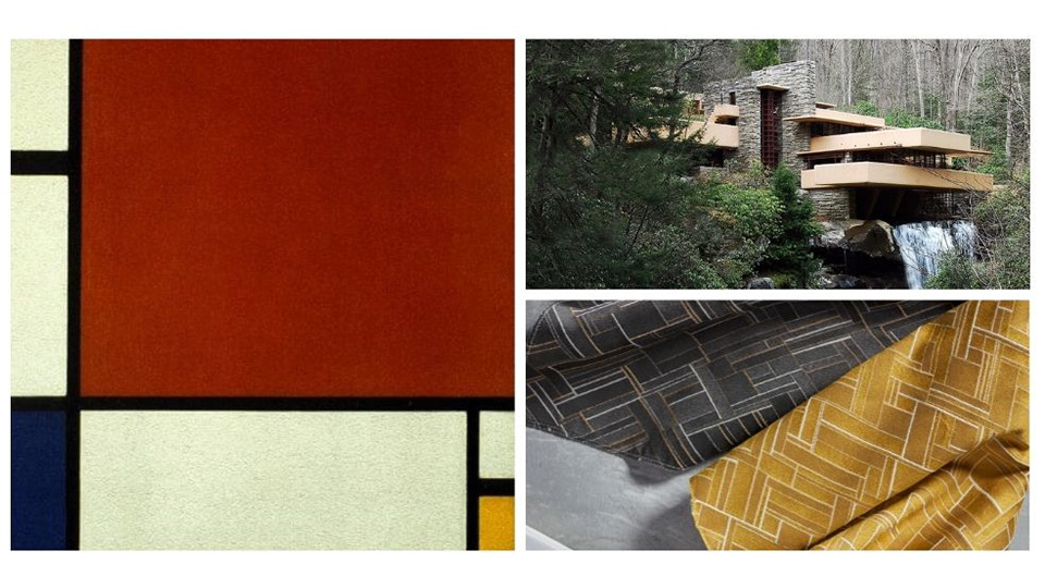
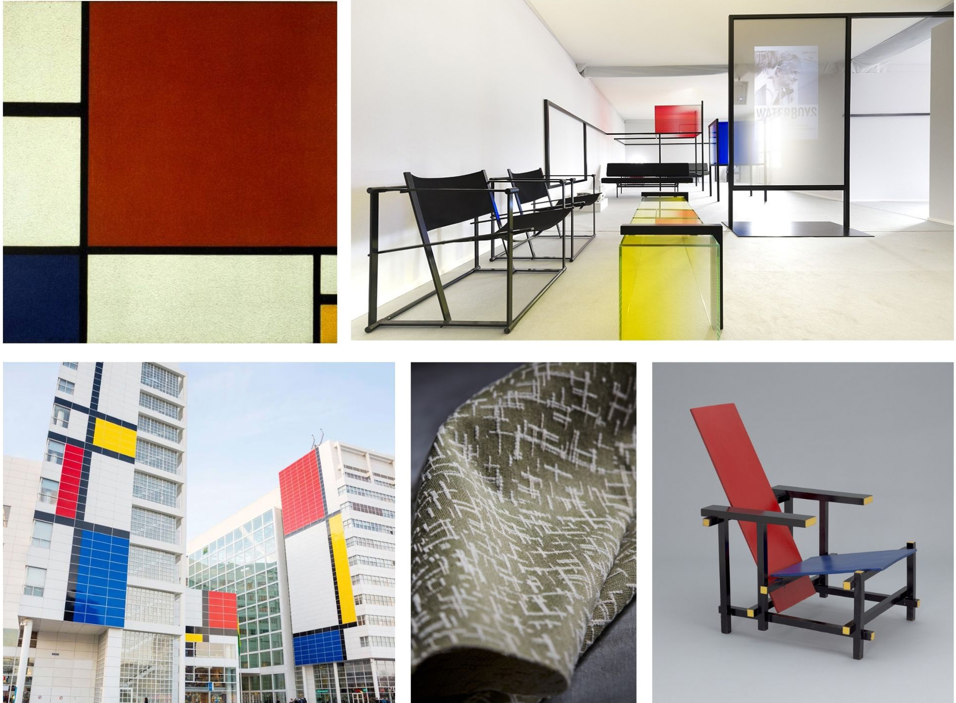
One of the most iconic pieces of artwork to emerge from the movement is Mondrian's Composition II in Red, Blue and Yellow. In the world of interior design, Rietveld’s Red Blue Chair is a 3D manifestation of the De Stijl color palette.
More recently, the Dutch Pavilion at the 2017 Cannes Film Festival was designed as a deconstructed Mondrian with black, minimalist, boxy furniture in a white room paired with accents of red, yellow and blue.
Also pulling inspiration from Mondrian, American abstract artist and architect Richard Meier used white to make the outside of the City Hall of The Hague the canvas for the "World's Largest Mondrian."

Photos courtesy of piet-mondrian.org, archdaily.com, leibal.com, and moma.org.
Fashion has also been influenced by De Stijl’s use of primary colors. New York magazine coined the word “Kindercore” to describe fashion and home design characterized by bright yellow, blue, red and green – from color-blocked sweaters and shoes to coffee tables.
Our own Neo pattern takes direct inspiration from Mondrian, hinging on abstract, linear forms and color for expression. The criss-crossed lines create square and rectangular shapes that carry forth the ordered geometry in Mondrian's works.
Order & Harmony
De Stijl's focus on orderly, harmonious forms has had an enduring influence in the tech world as well. Take web design as an example. Generally, the current prevailing website aesthetic features clear delineation of space, often using squares and rectangles with sparse color, to communicate elegance and harmony.
The logo for Microsoft Windows and the Windows 10 operating system, with their simple geometric forms, straightforward colors and clean lines, are disciples of De Stijl. Apple’s iPad widgets, with their geometric forms and clean lines in organization, are also inheritors of the movement’s legacy.

Photos courtesy of theverge.com and speckyboy.com.
Harmony and Utopia from our Elemental Collection take direct inspiration from the De Stijl ethos of order and idealism as well. Harmony unifies space using intricate, fine straight lines, which create a calming, pleasing design. Similarly, Utopia uses cross hatching threads to generate a sense of equilibrium, making it the ideal backdrop to any space.
De Stijl Today
Artistic movements are constantly being re-invoked and reinterpreted for modern applications. In its timeless ability to evolve, we continue to see the lasting influence of De Stijl from architecture to technology and everything in between.
Where are you finding De Stijl influence today? Capture an image and tag us on any of our social platforms. We'd love to see what inspiration you can find!

